|
|
Post by ~*Keish*~ on Jan 4, 2008 0:26:43 GMT -5
just throwing these two ideas out there ...
first how do you like this font?
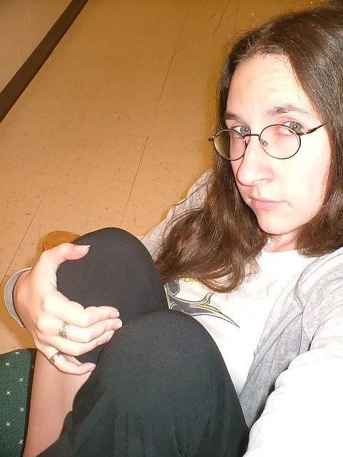
second, i was looking through my own pictures when i came across this pic ...

do you think it'd look really lame/stupid to make all the guys look like that, a big head w/ little bodies? we could just line them up at the bottom and top of the flag.
i'm working on getting pics of the boys. i got a bigger version of Aroh's picture and i got different pics of Von, Dan, Taylor, and Kyle. i'll post them tommorrow morning when i'm on my computer at work and things go a bit faster.
|
|
|
|
Post by amanaka2012 on Jan 4, 2008 3:47:24 GMT -5
maybe for the background since it had to be brownish we can change the cambodia flag to different shades of brown
|
|
|
|
Post by ~*Keish*~ on Jan 4, 2008 9:18:10 GMT -5
a few more ideas ...
this background? i like it but i also hate it. lol.
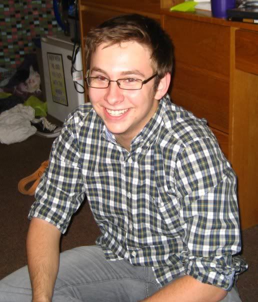
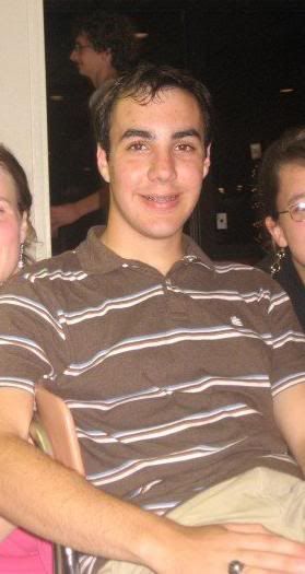
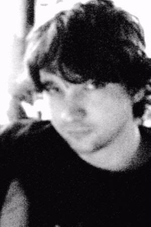
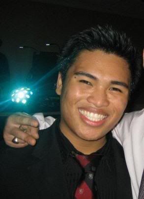
and here are some pics of the boys.
Aroh and Kenyon's are just bigger versions of the pics on the games main page.


all of Taylor's pics were really small. the only big one was a black and white pic.
and i like the pic of Von that was used on the main page of the game, but i know how much he HATES that pic. he was apparently wasted when it was taken or something. so i found this one instead.
|
|
Jia
Full Member
 no regrets.
Posts: 138
|
Post by Jia on Jan 4, 2008 11:29:45 GMT -5
we could maybe also use the angkor wat (famous cambodian temple) for the background. it's brown and has a lot of cultural significance.  |
|
Jia
Full Member
no regrets.
Posts: 138
|
Post by Jia on Jan 4, 2008 11:30:13 GMT -5
note: it also appears on the national flag of Cambodia. =)
|
|
|
|
Post by KJ on Jan 4, 2008 12:32:41 GMT -5
Here is a sample of what I have done, taking all suggestions into consideration. Let me know what you think honestly. I will be here at work for serveral more hours and have saved a PDF format, so I can make any adjustments needed.  |
|
|
|
Post by KJ on Jan 4, 2008 12:37:06 GMT -5
I made all the pictures B&W since one was, it looks better. I also used a fairly colorful background to contrast. I filtered the background through the picture, so it wouldn't look like we just "dropped a picture" into the design. I added each guys name and also translated the words of the Tribe, so they would know what it meant.
I made all of the guys equal size, so nobody stands out, symbolizing teamwork.
Let me know what you think?
|
|
Jia
Full Member
no regrets.
Posts: 138
|
Post by Jia on Jan 4, 2008 13:41:18 GMT -5
it's great kj, but "strength" is misspelled.
|
|
|
|
Post by KJ on Jan 4, 2008 14:10:19 GMT -5
Spelling fixed! oops,   |
|
|
|
Post by ~*Keish*~ on Jan 4, 2008 14:35:35 GMT -5
i like the design and colors.
the font is ok, but i'm not a huge fan.
and just because i'm anal retentive about things being symetrical, i was thinking that the boys that are on the left, their names in their little boxes should be on the bottom left and angled like this \ and the boys on the right side should have their names on the bottom right of their boxes and they should be angled like this /.
oh. and you have Kenyon and Aroh mixed up.
otherwise good deal. i wish i had paintshop on my computer at work. my normal comp. is being worked on and i'm stuck w/ a crappy old one that has like NOTHING on it.
|
|
|
|
Post by KJ on Jan 4, 2008 15:07:20 GMT -5
what is the name of the font you like?
|
|
|
|
Post by ~*Keish*~ on Jan 4, 2008 15:22:32 GMT -5
it's called Carmen.
it might not even look right w/ the design. i'm just curious.
|
|
|
|
Post by KJ on Jan 4, 2008 15:43:27 GMT -5
Here it is! with the suggestions done. What do ya think??? 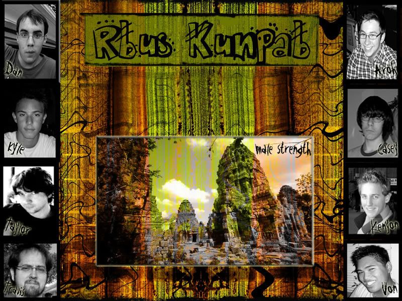 |
|
|
|
Post by KJ on Jan 4, 2008 16:34:20 GMT -5
Gray box fixed... |
|
Jia
Full Member
no regrets.
Posts: 138
|
Post by Jia on Jan 4, 2008 17:25:00 GMT -5
aww kj aroh and kenyon got switched again. like the font tho.
|
|